Thursday, 5 July 2012

The Show

This has to be one of the most embarrassing things I've ever done. Having people walk around and look at my work? It was terrifying! I stood well away from my work, but so that I still had a view of it so I could see who exactly was looking at my stuff. So I was pretty much in ninja mode all evening! Although I did get some nice comments, so maybe I need not have been so shy about it all! 

Setting up the show itself took FOREVER. The whole process killed my legs by the time Saturday came and I could barely walk! All of my recent work made it in, apart from one of my Advertising posters, but that was only because it had a big black ink blotch when it came out of the printer (which was a shame really, I would have liked all four to have been there). I hope for those that came though, that you liked what you saw :) 

All photos were taken by others in my class at the show! It took place in Bristol at the CentreSpace Gallery.


Monday, 2 July 2012

Stray Thread

For our final project at uni, we were allowed to do ANYTHING we wanted. Me being the indecisive person that I am, it took me awhile to decide! I eventually decided that since I love sewing, I would make a set of sewing kits (packaging) that was aimed towards people of my age range (Young adult. About 16-25 ish) that would contain all the things you would need to sew. There would be three in the set, each representing a different stage: Beginner, Intermediate and Advanced. So hopefully, if you brought the beginner you would then advance up the sewing learning curve and get the other two kits!

Coming up with the brand name for these kits took forever. All the good names are taken! I must have gone through at least 20 different names before I settled on "Stray Thread". The logo itself is pretty simple and very colourful so that it appealed to my target audience! I really wanted to avoid the obvious sewing reference but I was convinced by my friends that this was impossible. I still like the final result though, so it's not all that bad.

As for the packaging, they are triangular in shape, inspired by Tailors Chalk! (I couldn't cope without it!) They also have REAL (Yes, REAL) fabric sewn onto them. I mean, why have a rubbishy looking texture put on them when you could put the real thing on it? You can interact with the packaging then and the whole thing becomes a lot more interesting.

Admittedly, this was actually my second choice for my project as my teacher didn't seem to be all that keen on my first choice. For some reason that I still don't reeeeally understand. But never mind! I still enjoyed this project :)


Sunday, 24 June 2012

My Business card

I thought long and hard about what sort of impression I wanted to give off with my own personal business card. Did I wanna look REALLY professional? Sexy? Funny? Friendly? Approachable? Etc?

Originally, I wanted a funny card, but then I found out: I'm not that funny.At least not in card form!

So a change of plan: Cute card! I'd like to think that I'm friendly and approachable, yet I could design it so that it looked good. I loved some of the cute business cards I saw when I was looking around online for inspiration, so I went off and designed my own little fuzzy hamster!

I spent awhile on that little hamster, I drew many hamsters before I came up with a design that I liked. Which I then drew up on Illustrator and finalised him. I got the colour scheme from Kuler (best website ever), which was very bright and bold! I put it all together and many alterations later and... it was done!


Wednesday, 20 June 2012

"Fuzzy Hamster Design"?

Now, why did I choose Fuzzy Hamster as my "designer" name? Well... it was between that and "Black Dragon". I love hamsters and I also love dragons.

So how was this epic battle of choice decided? By asking on Facebook of course! My friends believes that Fuzzy Hamster suited me better, so that's what I went for.

Who is the fuzzy hamster in my life? Her name is Zelda and is the cutest little hamster there ever was! She likes cheese and making people feel guilty by staring at them... but hates plastic wrapper noises! They scare her, the silly little thing.

Friday, 8 June 2012

Information Design

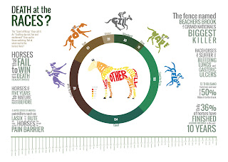
Well, this was certainly.... interesting. We were asked to create an infographic based on an article from a newspaper. I chose one based on the Cheltenham horse deaths and thus based my infographic on horse racing in general.

I took all of my information from Animal Aid's horsedeathwatch.com website. I did ask horse racing authorities for data, but it seems that they don't give this out, despite claiming that they do. Hm...


Corporate Identity

So for this brief we were asked to create an Identity for a new sports initiative for young people called "Talent Hubs". This included a logo, poster, pop-up banner, t-shirt, water bottle, e-mailer and web banner. 

I rather enjoyed this brief and for probably the first time, I made a logo I truly loved and believed in! Allow me to bore you with the meanings behind the logo: 

The logo consists of a graphic element along with a clean, young typeface that will appeal to the target audience. The graphic encompasses everything Talent Hubs is. The central circle is the “hub” of Talent Hubs and each of the circles surrounding it represents an individual, whether this is the teenager joining the initiative or members of the Wesport team running it is up to the person interpreting it. The orange circle highlights this aspect of the logo, but this is also the spot where you insert yourself into the Talent Hubs initiative. Although the individual is important, these circles come together to form a TEAM, a very important aspect in sports, and makes up the bigger picture. The graphic has a sense of movement, which is important in pretty much all sports. It is also: note that the logo is moving to the right (forwards), as you want teenagers progressing forward towards their goals and not moving away from them. It may not be so noticeable, but the graphic is triangular in shape. Triangles are one of the strongest shapes and so serves as a symbol of strength and among other meanings it is a focus point for energy.

More images to come when I figure why I can't convert them into jpegs!!


Monday, 4 June 2012

Advertising

I didn't think I'd enjoy this, but it turned out alright in the end! The brief was to design an integrated advertising campaign for the upper market clothing chain Ted Baker. We had to chose between one of their different ranges that they sell and I chose watches. My designs are typography based and are based on quotes and symbols of eternity.